Use the Eclipse table graphing tool to create a visual representation of your business data. When you see your sales figures, for example, in graphical format, sometimes it is easier to see how your business is performing than if you simply look at the numbers. You can create ![]() bar,
bar, ![]() line, or
line, or ![]() pie graphs in two- or three-dimensional formats, depending on your purposes.
pie graphs in two- or three-dimensional formats, depending on your purposes.
To create a table graph:
Display and populate a window that includes a table.
Do one of the following to display the Graph Options dialog box:
|
To create a graph based on... |
Do this... |
|
all of the data within the table |
Right-click anywhere within the table and select Create Graph from the menu. |
|
a selected set of data within the table |
|
To select the graph type to create, click one of the following buttons:
|
Button |
Graph Type |
|
|
Two-dimensional bar graph. |
|
|
Three-dimensional bar graph. This is the default. |
|
|
Two-dimensional line graph. |
|
|
Three-dimensional line graph. |
|
|
Two-dimensional pie graph. |
|
|
Three-dimensional pie graph. |
In the Graph Title field, enter a title that describes what the graph will show.
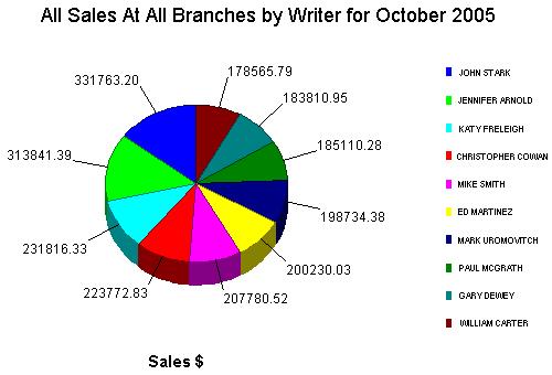
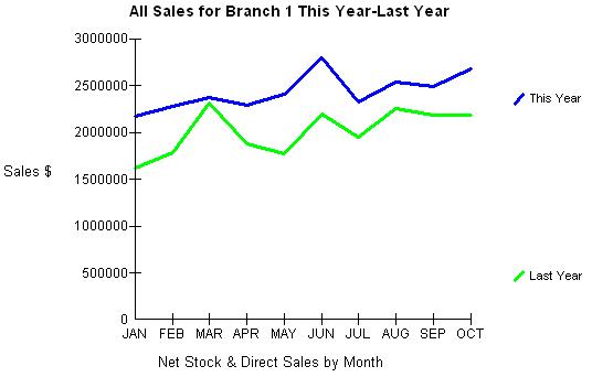
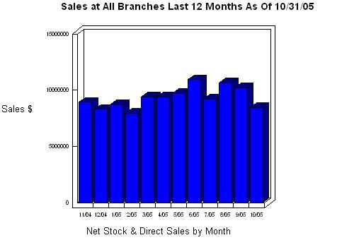
For example, All Sales for the Last 12 Months.
In the Graph Data area, do the following:
In the Category (X-Axis) column, select one check box. The value you select should be the group of data you want to evaluate.
In the Values (Y-Axis) column, select as many check boxes as needed. The values from this column should be an amount, such as a dollar value, or a frequency of occurrence.
Do either of the following, as needed:
|
To... |
Click this button... |
|
|
|
|
|
Click Create to display the Graph window.
See Also:
Table Graphing Overview
Toggling Between Graph Types